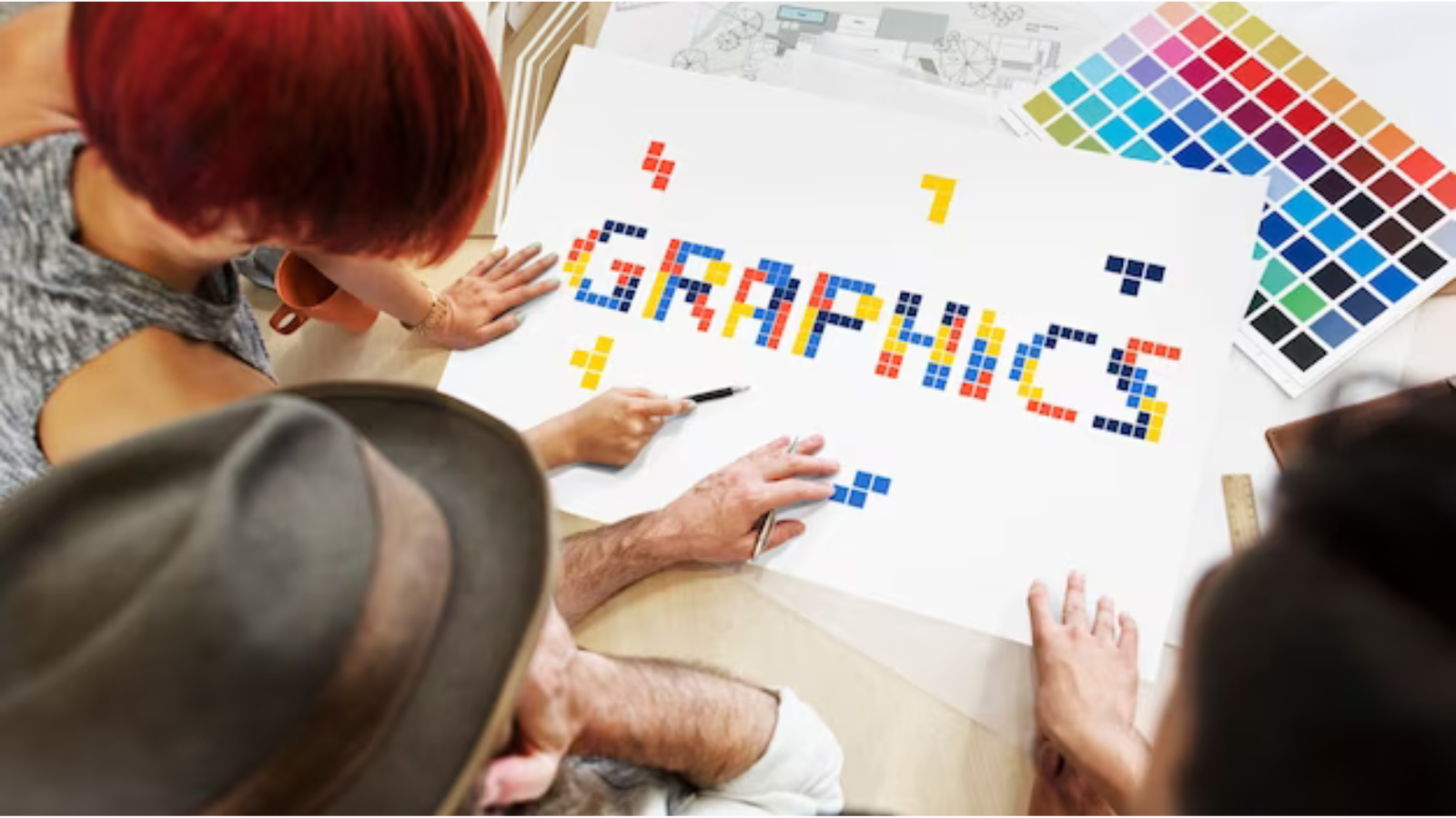
In the world of design, color isn’t just about aesthetics; it’s a powerful tool that can evoke emotions, shape perceptions, and influence behavior. From the calming effect of blue to the energy of red, understanding the principles of color psychology is essential for designers looking to create impactful visual communication. In this blog post, we’ll delve into the fascinating realm of color psychology and explore how designers can harness the emotional impact of color to create compelling designs that resonate with their audience.
Understanding Color Psychology:
Color psychology is the study of how different colors affect human emotions, moods, and behaviors. Each color has its own psychological associations, cultural significance, and emotional triggers, making it a potent force in design. By understanding the psychological effects of color, designers can strategically use color to convey messages, set the tone, and create memorable experiences for their audience.
The Emotional Impact of Color:
- Red: Associated with passion, energy, and excitement, red is a powerful and attention-grabbing color. It can evoke strong emotions and stimulate the senses, making it an effective choice for creating urgency, promoting action, and grabbing attention in design.
- Blue: Blue is often associated with calmness, tranquility, and trust. It has a soothing effect on the mind and body, making it an ideal choice for conveying reliability, professionalism, and stability in design. Blue is commonly used in corporate branding, healthcare, and technology industries to instill a sense of trust and confidence in the audience.
- Yellow: Yellow is the color of sunshine, optimism, and happiness. It can evoke feelings of warmth, cheerfulness, and positivity, making it a popular choice for designs aimed at capturing attention and conveying a sense of optimism. Yellow is often used in branding and marketing to evoke a sense of joy and energy in the audience.
- Green: Green is associated with nature, growth, and harmony. It has a calming and balancing effect on the mind, making it a versatile choice for designs aimed at promoting health, sustainability, and environmental awareness. Green is often used in branding and packaging for organic products, eco-friendly initiatives, and wellness brands.
- Purple: Purple is the color of royalty, creativity, and spirituality. It can evoke feelings of luxury, mystery, and sophistication, making it a popular choice for designs aimed at targeting upscale audiences or conveying a sense of elegance and exclusivity. Purple is often used in branding for beauty products, luxury goods, and creative industries.
Harnessing the Power of Color in Design:
- Understand Your Audience: Consider the demographics, preferences, and cultural backgrounds of your target audience when selecting colors for your designs. Different colors may have different associations and meanings across cultures, so it’s important to choose colors that resonate with your specific audience.
- Use Color to Convey Messages: Use color strategically to reinforce the message or narrative of your design. For example, warm, vibrant colors like red and orange can evoke a sense of urgency or excitement, while cool, calming colors like blue and green can convey a sense of trust or relaxation.
- Create Visual Hierarchy: Use color to create visual hierarchy and guide the viewer’s attention to key elements in your design. Use contrasting colors or bold accents to highlight important information, calls to action, or focal points within your design.
- Consider Color Combinations: Pay attention to color combinations and how different colors interact with each other in your design. Experiment with complementary, analogous, or monochromatic color schemes to create visual harmony and balance in your designs.
- Test and Iterate: Test different color combinations and variations to see how they impact the emotional response and perception of your design. Use feedback from users or stakeholders to refine your color choices and optimize the effectiveness of your design.
Conclusion:
Color psychology is a powerful tool in the arsenal of designers, allowing them to evoke emotions, shape perceptions, and create memorable experiences for their audience. By understanding the psychological associations of different colors and how they impact human behavior, designers can strategically use color to convey messages, create visual hierarchy, and guide the viewer’s attention in their designs. Whether it’s branding, marketing, web design, or product packaging, color plays a central role in visual communication, influencing how people perceive and interact with design materials. By harnessing the emotional impact of color, designers can create designs that resonate with their audience, evoke desired emotions, and leave a lasting impression.


